Benefits of Using Skeleton Screens
Using skeleton screens enhances the user experience during page loading by maintaining user engagement, creating a perception of faster loading times, and reducing cognitive overload by providing a preview of the page's layout. These benefits contribute to a more user-friendly and efficient interface for websites and applications.
A skeleton screen is used as a placeholder while users wait for a page to load. This progress indicator is used for full page loads and reduces the perception of a long loading time by providing clues for how the page will ultimately look. A skeleton screen is a design pattern used to indicate that a page is loading while providing users with a wireframe-like visual that mimics the layout of the page. This specific type of progress indicator is used exclusively for full-page loads.
Benefits of Using Skeleton Screens:
-
Prevent User Frustration: Skeleton screens prevent users from thinking that the website or application is not working. Instead of a blank screen, users see an outline of the content being loaded, which keeps them engaged and patient while the page loads.
-
Perceived Faster Loading: Skeleton screens create the illusion of a shorter wait time. Since they resemble a wireframe of the final page layout, users perceive that the page is progressively loading, making them feel like it won't take too long to load completely. This perception can improve the overall user experience.
-
Reduced Cognitive Load: Skeleton screens reduce users' cognitive load by giving them a visual preview of the page's layout. Users can start to understand the structure of the page and develop mental models of what to expect before the actual content is loaded. This gradual information presentation makes it easier for users to process and absorb the content when it appears, as they already have a basic understanding of the page's structure.

LinkedIn uses a skeleton screen to indicate that the page is loading
and to give users a sense of how the page will be structured.
What Are the Different Types of Skeleton Screens?
There are 3 main types of skeleton screens:
- Static-content and -image skeleton screens
- Animated skeleton screens
- Frame-display skeleton screens
Static-Content and -Image Skeleton Screens
These are the most common skeleton screens and look like wireframes, in which the light gray boxes represent content and images. The structure of the gray boxes mimics the structure of the final page with content. The skeleton screen helps users build a mental model of what will be on the page and even gives some clues as to the underlying information hierarchy.

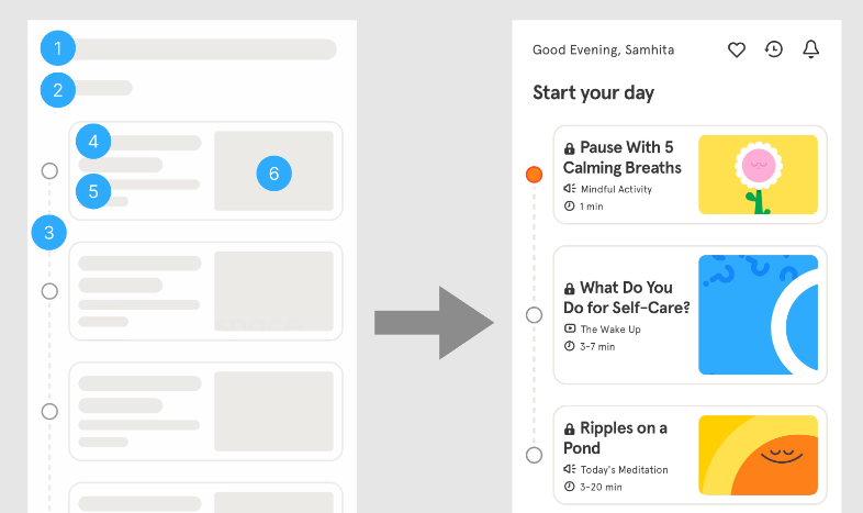
Headspace uses a skeleton screen to build users’ expectations for the structure of the page. This skeleton screen relies on design conventions, with large gray boxes representing images and long rectangle boxes representing text. The thickest gray line at the top (1) implies a page title, with a smaller secondary line underneath that would be descriptive text (2); below that, the page is structured into a sequence map (3) with a card at each step. In each card there will be a title (4), a bit of accompanying text (5), and an image (6). On the right you can see what the fully loaded page actually looks like.
Animated Skeleton Screens
Some skeleton screens include animations in the form of a pulsating movement, with the use of gradients or elements fading in and out. These are similar to wait animations (or spinners) and signify that the system is still working and still loading content, decreasing users’ perception of a long loading time by keeping users engaged on the content being loaded.
Note that animations of this sort can potentially be distracting, annoying, or even create accessibility problems for some users.
Frame-Display Skeleton Screens
One variation that we do not recommend is a skeleton screen that displays only the frame of the application without a content wireframe. These minimal skeleton screens only include the header, footer, and the background. This style doesn’t include placeholders of the content, and as a result, doesn’t give users a sense of the general structure of the page. A frame display is not recommended because, if users are forced to wait for too long, they will assume the page isn’t working because the screen is mostly blank.
Summary:
Skeleton screens, progress bars, and spinners are design elements used to indicate loading progress, but they are best suited for different situations:
-
Spinner/Wait Animation:
- Suitable for pages taking 2–10 seconds to load.
- Works well for individual modules or elements, like videos or cards on a dashboard.
- No need for pages loading in under 1 second.
-
Skeleton Screens:
- Effective for pages loading in under 10 seconds.
- Ideal for full-screen loading to provide a visual preview of the page's layout, reducing cognitive load.
- Should not be used for very quick page loads (under 1 second).
-
Progress Bars:
- Recommended for pages taking longer than 10 seconds to load.
- Provide users with a clear sense of the loading state and estimated wait time.
- Best for process-related indicators, especially when processes involve steps or tasks.
-
Avoid Frame-Display Skeleton Screens:
- Frame-display skeleton screens should not be used as progress indicators.
- They lack information about page layout and may confuse users during extended wait times.
Best Results:
- Choose the loading indicator (skeleton screens, progress bars, or spinners) based on the expected loading time.
- For shorter waits (2–10 seconds), consider spinners for individual elements or full-screen skeleton screens.
- For longer waits (over 10 seconds), use progress bars to provide users with clear feedback on the loading state.
- Avoid using skeleton screens or spinners for very quick page loads (less than 1 second).
- Ensure that the choice of loading indicator aligns with the specific context and type of process being performed by the system.
Thomas Mejtoft, Arvid Långström, and Ulrik Söderström. 2018. The effect of skeleton screens. Proceedings of the 36th European Conference on Cognitive Ergonomics (2018). DOI:http://dx.doi.org/10.1145/3232078.3232086
{{ 'Comments (%count%)' | trans {count:count} }}
{{ 'Comments are closed.' | trans }}